

SmartBe Investments.
Brand refresh & website.
Smartening things up.

Quantitative investing has a communication problem: the smarter the strategy, the harder it is to explain. SmartBe Investments built ETFs that give Canadian investors access to quantitative trading strategies — and needed a brand that made sophisticated feel simple rather than suspicious.
Financial services branding runs on a narrow track. Too playful and you lose credibility; too austere and you look like every other fund. Our refresh threaded it with precise brand graphics, confident typography, and a palette that says rigorous without saying impenetrable.
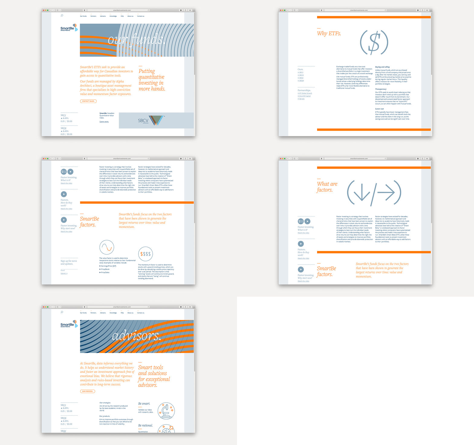
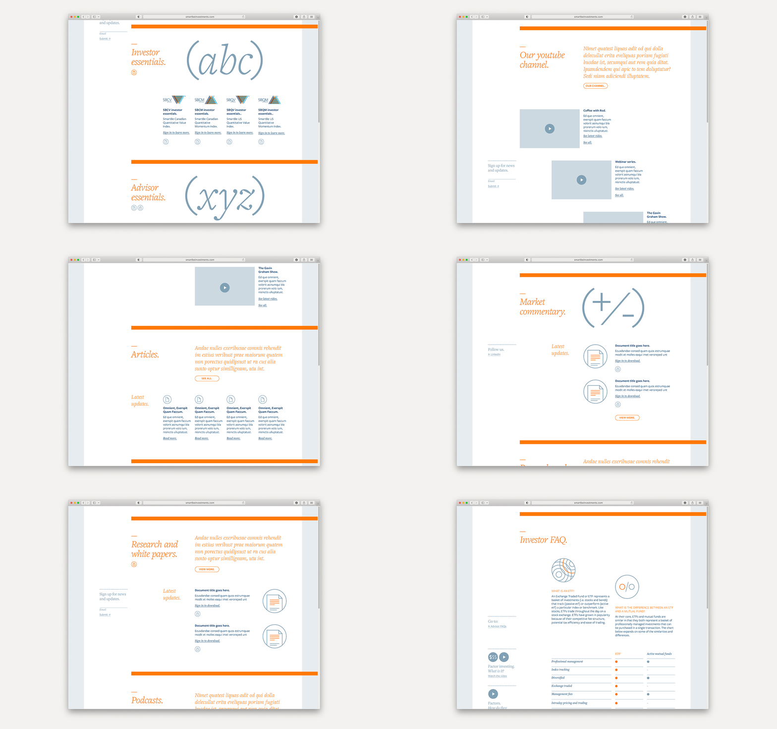
The system carries through to an investor-facing website designed to do what the category rarely manages: explain quantitative products clearly enough that a first-time visitor leaves understanding what they'd be buying. For a firm whose entire pitch is complexity simplified, the brand now practices what it preaches.
Brand Identity, Website



SmartBe Investments — Brand refresh & website
